Page 1 of 2

Landscape or Portrait?

PostPosted: September 22nd, 2016, 10:15 pm
by mitchiemasha
We managed to get 2 nights of gaming in this week, HQ at the table both nights. It looks like HQ is going to be the game of choice for some time. The new rules are getting much love. We played Triquetra by Mace, with a few extra twists thrown in the story... But, at the end I noticed a problem... Character sheets (A5 note pad paper) are starting to look a bit of a mess. The original HQ and Designer kit ones are of no use, it's almost as though they were designed by someone who hadn't played the game, although an excellent starting template.

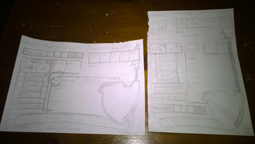
I needed a solution... Enter 2 rough sketches.
Image

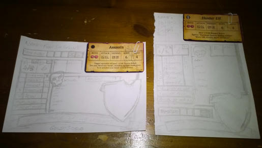
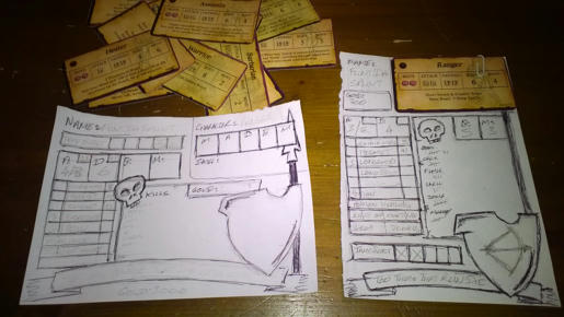
The top right hand corner fits the Character Card in the same style as Sotoris. The bare sheet will feature the same boxes blank underneath to create your own character starting stats.
Image

Image

So landscape or portrait, that is the question?

Re: Landscape or Portrait?

PostPosted: September 22nd, 2016, 11:10 pm
by mitchiemasha
There's quite a unique way the equipment beneath the A&D box works. It makes for much easier addition of what equipment you have and any starting skill bonus, (top right of the box). To the left of each piece of equipment you put the attack modifier (if any), to the right the defence (if any).

The characters are limited to what they can carry. The bottom 2 lines (7&8) can be divided in 2 for gems/jewels/potions, marked with a dotted line down the middle, or stay as 1 for a larger item. There'll only be 6 lines with the extra box at both sides but as the Wizard only has 4Bp he'll have to scribble 2 out, 5Bp scribble 1 out. They'll be dotted lines down the edge of line 7&8 enabling 7 and 8Bp characters the ability to carry more weapons but at the cost of potions, if they choose to.

An easy system for Body points limits carry capacity. We'll need to test it out a few times to see how it goes. Possibly add another line.

In true HQ spirit... We needed to oversize the house shield, include a motto banner and provide plenty of space for kill count competition. Everyone seems to get a bit carried away with these things. On the back will be a large open scroll to record story progression.

Just need to piece it together in Photoshop.

Re: Landscape or Portrait?

PostPosted: September 22nd, 2016, 11:54 pm
by knightkrawler
GimmeYerGold did something quite similar.
Look for the right thread (I need to go to work now) and see if there's any designs you can use to start from.

Re: Landscape or Portrait?

PostPosted: September 23rd, 2016, 1:40 am
by Showdown35
To answer the question of the thread topic, I prefer landscape.

Re: Landscape or Portrait?

PostPosted: September 23rd, 2016, 2:05 pm
by mitchiemasha
Thanks...

Landscape will likely leave more room round the board too. I'll have a look for that thread.

Re: Landscape or Portrait?

PostPosted: September 23rd, 2016, 2:31 pm
by Goblin-King
Definitely Landscape.
Since the character sheet is also landscape it looks more harmonic.

Re: Landscape or Portrait?

PostPosted: September 23rd, 2016, 3:00 pm
by mitchiemasha
I hadn't thought about it harmonising with the character card. You're right thanks.

Re: Landscape or Portrait?

PostPosted: September 23rd, 2016, 3:39 pm
by QorDaq
I'm all about reducing the vertical requirements for players at the table. i.e. Landscape tends to work best for most tables as that style of player sheet leaves more room for the board and others odds and ends. Since most players (exceptions for hyperactive people of course), naturally occupy their own body-width of table space any way, landscape layouts positively impact the over all playable surface of a table significantly in my opinion.

As an aside, it's awesome that your group is excited for regularly scheduled sessions!

maj!

Re: Landscape or Portrait?

PostPosted: September 24th, 2016, 12:01 am
by Anderas
Seeing this attempt, i would go for landscape, too.

I consider Landscape being better, because,
* it fits with the card format
* it fits better with the available table space in most houses

It's a beauty you made there! It's functional and good looking at the same time. You nearly lured me to switch to your design; except that i have already printed 20+ characters in my design, so that won't happen. :)

Re: Landscape or Portrait?

PostPosted: September 24th, 2016, 2:55 am
by mitchiemasha
The actual card design I have to thank Sotoris for. He who runs our PBF game. I knew they'd be the ones I used from the first moment I seen them. Everything about them is how they should be. I've created a combined PDF if anyone's interested, nicely organised in the document.

For the character sheet, I might scan a neater drawing rather than design it in Photoshop, probably be easier.

As an aside, it's awesome that your group is excited for regularly scheduled sessions!

It comes and goes in phases, I'm hoping we keep HQ on the table for a while.

Thanks for the input everyone, it's really appreciated.