Page 1 of 3

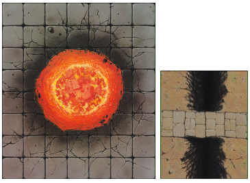
Chaos Pit / Stone Bridge (remake from Ogre Horde)

PostPosted: October 8th, 2017, 7:17 am
by lestodante
I reworked a bit the Pit of Chaos and the Stone Bridge tiles from the Against the Ogre Horde pack, because I didn't like the grid on them.
You can download the jpg image from this link: http://www.lestodante.com/hq/tiles/Ogre ... odante.jpg
Hope I didn't make mistakes when putting it on the A4 paper.

Image

Re: Chaos Pit / Stone Bridge (remake from Ogre Horde)

PostPosted: October 8th, 2017, 8:33 am
by aaronAGN
Well that's certainly cool. Well done.

Re: Chaos Pit / Stone Bridge (remake from Ogre Horde)

PostPosted: October 8th, 2017, 9:16 am
by Goblin-King
YES! Would you look at that? How hard was it to do that MB?
I share your hatred for that lazy grid they just slapped on top of the artwork!

Sadly the other tiles are a bit harder to do

But well done for these |_P

Re: Chaos Pit / Stone Bridge (remake from Ogre Horde)

PostPosted: October 8th, 2017, 9:49 am
by knightkrawler
That does look very good, indeed!

Re: Chaos Pit / Stone Bridge (remake from Ogre Horde)

PostPosted: October 8th, 2017, 11:05 am
by lestodante
Goblin-King wrote:Sadly the other tiles are a bit harder to do |_P


The room with the mosaic is really hard, I should repaint a lot of things on it.
The carpet instead could be done with not so much effort, I think.
What I think is very difficult is the external tile, because I can't imagine how to draw the lines on the grass/stones and still leaving a natural look.

Re: Chaos Pit / Stone Bridge (remake from Ogre Horde)

PostPosted: October 8th, 2017, 1:37 pm
by Goblin-King
I know what you mean.
But if you really wanted to do this I think it can be done. Obviously you can't make tiles on grass and rocks and make it feel 100% natural.
But you could make semi-natural cracks in the rocks and dark lines of grass to make something that players can use as squares yet still fits in more natural than that ugly grid.

ANYthing would be an improvement.

Man, I gotta say this is really one of my pet peeves in board gaming. Why do game developers think it's okay to just put a black grid on top of artwork and call it a day?
At least try to make the terrain align with the grid.
At least put objects on TOP of the grid. Like rocks, pebbles, cars etc etc... The ogre fire pit is a great example. You did the right thing here.

Re: Chaos Pit / Stone Bridge (remake from Ogre Horde)

PostPosted: October 8th, 2017, 2:48 pm
by lestodante
I think I can try by putting some grass instead of the lines, like in the DragonStrike Valley board.
Do you think I should use the same square size for both top and bottom? I mean, the upper part (rocks) is intended to be on a higher level (like a crag) than the one at the bottom (with grass and skeleton).
So in this case it would be not playable, but with more realistic perspective. Or I can use the same size but this will mean that the rock wall is not tall (and you can even jump down from it).
What do you think?

Re: Chaos Pit / Stone Bridge (remake from Ogre Horde)

PostPosted: October 8th, 2017, 4:39 pm
by Goblin-King
I'd say keep the current grid.
The artwork itself conveys the height difference well enough.
No reason to make the grid confusing. Especially as you are kinda trying to hide a grid on top of art that doesn't lend itself particularly well to having a grid.

Re: Chaos Pit / Stone Bridge (remake from Ogre Horde)

PostPosted: October 8th, 2017, 11:20 pm
by knightkrawler
As long as there's no grid running over the side of the mountain/hill/elevation, you should be fine with same-size squares.
As G-K said, the artwork should do the trick to show the difference in height.

Re: Chaos Pit / Stone Bridge (remake from Ogre Horde)

PostPosted: February 23rd, 2018, 9:09 pm
by Daedalus
lestodante wrote:
Goblin-King wrote:Sadly the other tiles are a bit harder to do |_P

. . . What I think is very difficult is the external tile, because I can't imagine how to draw the lines on the grass/stones and still leaving a natural look.

I wouldn't want to discourage you from creating a better looking gridded tile, so do it if it's worth your effort. A tactical tile that looks better on the board is more likely to be used in fan Quests. But keep in mind AtOH doesn't actually use it for meaningful movement or combat. Essentially, the surface tile is just a bigger stairway tile.

The BQP contains a similar tile, the ice cave entrance. It serves as well as the surface tile for a glorified entrance/exit, but it does so without a grid. With that in mind, it could be enough to simply remove the grid from the surface tile and call it done. It will be sure to resemble the original art and is very doable. [If you left just 1/8 inch or about 3 mm of grid markings around the outer edge of the tile, you'd have a handy reference for eyeballing figure placement. -edit]

A hybrid option is also possible by limiting a tile look to the rocky ledge. That portion would be simpler to render and would serve as a visual guide for where to line up figures on the lower, non-gridded portion of the tile.