Okay...here is a rough idea of what I think a heroquest board would like if it were made
with hex spaces. I simply used a hex-space map creator (rpg manager v1.8) to make this,
and I will attempt a better draft tonight by hand. But I thought I would post this to see what
others thought.
Me...I think it looks pretty neat. Could be a lot of fun.
The yellowish spaces would be the rooms...the gray spaces would be the hallways. This shows the
middle room and the top-left section of the board. The red lines would be the walls between the
rooms.
-
- Advertisement
Make a small donation to Ye Olde Inn!
Every cent received goes toward Ye Olde Inn's maintenance and allows us to continue providing the best resources for HeroQuest and Fantasy Gaming fans.
Hex Space Heroquest Board
23 posts
• Page 1 of 3 • 1, 2, 3
Hex Space Heroquest Board
![]() by torilen » August 20th, 2013, 7:47 pm
by torilen » August 20th, 2013, 7:47 pm
You do not have the required permissions to view the files attached to this post.
Magic beats the blade every time...unless you are caught asleep or else-wise occupied.
Find me at the following:
http://www.drivethrurpg.com/browse/pub/ ... Strategies
https://www.facebook.com/fantasygamestr ... page_panel
https://twitter.com/QuestingHeroes
https://www.patreon.com/fantasygamestrategies
https://fantasygamestrategies.com/
Find me at the following:
http://www.drivethrurpg.com/browse/pub/ ... Strategies
https://www.facebook.com/fantasygamestr ... page_panel
https://twitter.com/QuestingHeroes
https://www.patreon.com/fantasygamestrategies
https://fantasygamestrategies.com/
Rewards:


- torilen
Ice Gremlin
- Posts: 2081
- Joined: October 9th, 2009, 4:18 am
- Location: Virginia, USA
- Forum Language: English (United States)
- Hero:

- Evil Sorcerer: Morcar
- Usergroups:


Advertisement
Make a small donation to Ye Olde Inn!
Every cent received goes toward Ye Olde Inn's maintenance and allows us to continue providing the best resources for HeroQuest and Fantasy Gaming fans.
Re: Hex Space Heroquest Board
![]() by Templar » August 21st, 2013, 5:17 am
by Templar » August 21st, 2013, 5:17 am
Heh, nice 
Isn't the central room a little small though? And the north-south and east-west corridors are the same width...is this on purpose?
I think you and I think differently on this issue. I would not go the route of walls following the hexes. It is a much more natural way of doing rooms on a hex grid though, so I understand why you did it like this.
Also, regarding hexagonal maps...normal attacks are obvious. What would the spear do? allow for attacks up to 2 hexes away? In that case ranged weapons should need a minimum of three hexes to be used...Right?
"If you have to ask, you're streets behind..." - Pierce Hawthorn
Rewards:

-

Templar
Ogre Chieftain
- Posts: 232
- Joined: November 9th, 2011, 4:31 am
- Location: Karlstad, Sweden
- Forum Language: British English
- Hero:

- Evil Sorcerer: Morcar
- Usergroups:
Re: Hex Space Heroquest Board
![]() by torilen » August 21st, 2013, 9:15 am
by torilen » August 21st, 2013, 9:15 am
The hallways being the same size - accident, not on purpose.
Spear - yes, I suppose it would be used up to two spaces away, and range weapons would require a minimum of three spaces.
As for walls - I'll play around with things and see how it would look/work with straight walls.
I'm going to work on this in just a little bit, so we'll see what happens.
Spear - yes, I suppose it would be used up to two spaces away, and range weapons would require a minimum of three spaces.
As for walls - I'll play around with things and see how it would look/work with straight walls.
I'm going to work on this in just a little bit, so we'll see what happens.
Magic beats the blade every time...unless you are caught asleep or else-wise occupied.
Find me at the following:
http://www.drivethrurpg.com/browse/pub/ ... Strategies
https://www.facebook.com/fantasygamestr ... page_panel
https://twitter.com/QuestingHeroes
https://www.patreon.com/fantasygamestrategies
https://fantasygamestrategies.com/
Find me at the following:
http://www.drivethrurpg.com/browse/pub/ ... Strategies
https://www.facebook.com/fantasygamestr ... page_panel
https://twitter.com/QuestingHeroes
https://www.patreon.com/fantasygamestrategies
https://fantasygamestrategies.com/
Rewards:
- torilen
Ice Gremlin- Posts: 2081
- Joined: October 9th, 2009, 4:18 am
- Location: Virginia, USA
- Forum Language: English (United States)
- Hero:
- Evil Sorcerer: Morcar
- Usergroups:
Re: Hex Space Heroquest Board
![]() by torilen » August 21st, 2013, 9:45 am
by torilen » August 21st, 2013, 9:45 am
I don't think one could get away from having the walls follow the outline of the hex spaces.
See the example below - the room on the left shows one set of walls that close in on the spaces (the sides),
while the top shows a normal straight wall, and the bottom also show a wall that closes in on the spaces.
Any wall that closes in on the spaces, attempting to leave as much room as possible in each space while
still being straight - this just won't work.
The room on the left shows the original work - with just simple straight walls in the best place possible.
It cuts half the space off. You'll notice, if you come in from north or south, there could be a door on the
wall without it being in the middle of a space.
Coming in from east or west, however, you would have the door in the middle of a space no matter what,
which would need one of two things to happen:
1 - you count the door as a space
2 - you ignore the space the door is on and just move to the next space, as if the space the door is on does
not really exist.
Any thoughts?
You do not have the required permissions to view the files attached to this post.
Magic beats the blade every time...unless you are caught asleep or else-wise occupied.
Find me at the following:
http://www.drivethrurpg.com/browse/pub/ ... Strategies
https://www.facebook.com/fantasygamestr ... page_panel
https://twitter.com/QuestingHeroes
https://www.patreon.com/fantasygamestrategies
https://fantasygamestrategies.com/
Find me at the following:
http://www.drivethrurpg.com/browse/pub/ ... Strategies
https://www.facebook.com/fantasygamestr ... page_panel
https://twitter.com/QuestingHeroes
https://www.patreon.com/fantasygamestrategies
https://fantasygamestrategies.com/
Rewards:
- torilen
Ice Gremlin- Posts: 2081
- Joined: October 9th, 2009, 4:18 am
- Location: Virginia, USA
- Forum Language: English (United States)
- Hero:
- Evil Sorcerer: Morcar
- Usergroups:
Re: Hex Space Heroquest Board
![]() by Templar » August 21st, 2013, 6:27 pm
by Templar » August 21st, 2013, 6:27 pm
torilen wrote:Coming in from east or west, however, you would have the door in the middle of a space no matter what,
which would need one of two things to happen:
1 - you count the door as a space
2 - you ignore the space the door is on and just move to the next space, as if the space the door is on does
not really exist.
Any thoughts?
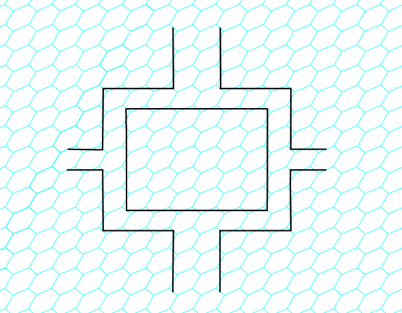
This is the crucial part of the whole thing, I think...To get reasonable walls AND resanable doors. As you say, IF we want straight walls and square rooms, we need to use point 1 or 2. Personally, I prefer 1.
This is what I imagine the doors would look like, more or less.
Also, regarding non-uniform hexagons...I have a WWII game called conflict of heroes, where hexes are used with different terrain. To allow for "artistic licence" and more natural maps, the terrain of a hex is counted as being the one present under a dot in the middle of the hex. I think this could be used on a hexagonal map to emphezise which room or corridor a hex belongs to. For example in the circular room below...
Now if one doesn't want door hexes, then this is not the style to go for...However I think this is the style I would use, if I made a hex map for heroquest
You do not have the required permissions to view the files attached to this post.
"If you have to ask, you're streets behind..." - Pierce Hawthorn
Rewards:
-
Templar
Ogre Chieftain- Posts: 232
- Joined: November 9th, 2011, 4:31 am
- Location: Karlstad, Sweden
- Forum Language: British English
- Hero:
- Evil Sorcerer: Morcar
- Usergroups:
Re: Hex Space Heroquest Board
![]() by torilen » August 21st, 2013, 6:58 pm
by torilen » August 21st, 2013, 6:58 pm
Just throwing this out there as another idea. Octo-shaped spaces.
It still could offer the problem of diagonal, but it would be much easier to simply
ignore the small squares between the spaces when moving diagonally, than it is
to ignore the diagonal movement in square spaces.
Now, with that said. I personally like the idea of making the door-spaces if using hex spaces. I like your depiction
of the doors in that instance.
I am not sure how that would fly with others at the Inn, much less out in the public. I can't think of any other game
off the top of my head that includes the door as a space.
Again, I would be fine with this.
You do not have the required permissions to view the files attached to this post.
Magic beats the blade every time...unless you are caught asleep or else-wise occupied.
Find me at the following:
http://www.drivethrurpg.com/browse/pub/ ... Strategies
https://www.facebook.com/fantasygamestr ... page_panel
https://twitter.com/QuestingHeroes
https://www.patreon.com/fantasygamestrategies
https://fantasygamestrategies.com/
Find me at the following:
http://www.drivethrurpg.com/browse/pub/ ... Strategies
https://www.facebook.com/fantasygamestr ... page_panel
https://twitter.com/QuestingHeroes
https://www.patreon.com/fantasygamestrategies
https://fantasygamestrategies.com/
Rewards:
- torilen
Ice Gremlin- Posts: 2081
- Joined: October 9th, 2009, 4:18 am
- Location: Virginia, USA
- Forum Language: English (United States)
- Hero:
- Evil Sorcerer: Morcar
- Usergroups:
Re: Hex Space Heroquest Board
![]() by Templar » August 22nd, 2013, 4:08 am
by Templar » August 22nd, 2013, 4:08 am
torilen wrote: I can't think of any other game off the top of my head that includes the door as a space.
Well you know, either it is a bad idea OR game makers have a difficult time thinking outside the box
I think I wrote this variation of a Richard Feynman qoute in some other thread...
"Playtesting is the sole judge of if a rule is functional".
What he really said was: "Experiment is the sole judge of scientific 'truth'."
torilen wrote:Just throwing this out there as another idea. Octo-shaped spaces.
It still could offer the problem of diagonal, but it would be much easier to simply ignore the small squares between the spaces when moving diagonally, than it is to ignore the diagonal movement in square spaces.
I'm sorry, but I dont understand your meaning here...when should you ignore the small squares? During movement? Isn't that the same thing as keeping the square pattern but allowing for diagonal movement?
"If you have to ask, you're streets behind..." - Pierce Hawthorn
Rewards:
-
Templar
Ogre Chieftain- Posts: 232
- Joined: November 9th, 2011, 4:31 am
- Location: Karlstad, Sweden
- Forum Language: British English
- Hero:
- Evil Sorcerer: Morcar
- Usergroups:
Re: Hex Space Heroquest Board
![]() by Big Bene » August 22nd, 2013, 6:05 am
by Big Bene » August 22nd, 2013, 6:05 am
This is technically the same thing as just using the good old square tiles. Just ignore all this diagonal vs. orthogonal reasoning - an adjactant square is an adjactant square, every square has eight of them, and that's it.torilen wrote:Just throwing this out there as another idea. Octo-shaped spaces.
Have a look 
Rewards:
 Miniature Exchanges.")

-

Big Bene
Halberdier
- Posts: 1401
- Images: 11
- Joined: September 30th, 2010, 5:23 am
- Location: Siebeldingen / Germany
- Hero:

- Usergroups:

Re: Hex Space Heroquest Board
![]() by torilen » August 22nd, 2013, 9:42 am
by torilen » August 22nd, 2013, 9:42 am
Okay...so the octo-shaped space wasn't the best sane idea I had yesterday...
Oh well. Back to the drawing board. I was working on the hex space idea some more last night,
and figured out that trying to make them out of tiles just might be easier than making an entire board.
(I might a lot of tile stuff because I don't have good programs to make big boards).
I'm still trudging along, though. I think this could still work.
I'm going to print a tester off in just a bit, to see what it looks like. I'll get back to you.
EDIT/UPDATE:
Three problems I'm seeing, after printing off a hex tile and testing it with some game pieces:
1 - If we used the idea of a door as a space, you would sometimes have the heroes being able to
attack a monster on the other side of the from three spaces...and sometimes only the single hero
in front of the door would be able to attack the other side. The same would be true for monsters.
2 - The hex spaces have to be a lot larger to accommodate the minis. Granted, the test I printed
had spaces larger than needed, but not by much. The spaces, just by nature, would be larger than
simple square spaces. This, of course, would make a full-size board much larger than the original.
3 - The larger spaces cause problems with the furniture...furniture pieces that take up three squares
would only take up two hex spaces. This, of course, isn't that big of a problem, because one wouldn't be
using the normal quest making materials (heroscribe, for example). But, it is an issue to be addressed
none the less.
Just some observances I made. I, for one, am not going to give up - if nothing else, I'll keep the hex
space idea for myself and any group I might manage to play with.
I will say this - for anyone who offers outdoor quests, the hex space will still work perfectly for that, as
there wouldn't be many walls and doors. And if determining the terrain of a space is an issue for you,
take a look at templar's example above, using the dots on the spaces (if a dot is covered by a certain
area of terrain, that whole space is that type of terrain).
Magic beats the blade every time...unless you are caught asleep or else-wise occupied.
Find me at the following:
http://www.drivethrurpg.com/browse/pub/ ... Strategies
https://www.facebook.com/fantasygamestr ... page_panel
https://twitter.com/QuestingHeroes
https://www.patreon.com/fantasygamestrategies
https://fantasygamestrategies.com/
Find me at the following:
http://www.drivethrurpg.com/browse/pub/ ... Strategies
https://www.facebook.com/fantasygamestr ... page_panel
https://twitter.com/QuestingHeroes
https://www.patreon.com/fantasygamestrategies
https://fantasygamestrategies.com/
Rewards:
- torilen
Ice Gremlin- Posts: 2081
- Joined: October 9th, 2009, 4:18 am
- Location: Virginia, USA
- Forum Language: English (United States)
- Hero:
- Evil Sorcerer: Morcar
- Usergroups:
Re: Hex Space Heroquest Board
![]() by Big Bene » August 23rd, 2013, 6:16 am
by Big Bene » August 23rd, 2013, 6:16 am
Edit: Sorry...
I first loaed up the pictures, then edited-in a lenghthy explantation. I just notice the latter was lost in the net...
Have no time to do it again now... Will update later.
Edit:
part one re-written
will be contiued
Edit:
finished
Well, you gave me something to think... just couldn't resist ... although I'm personally not for a hexagonal board pattern at all.
Let me explain.
Rectangular tiles (normally square-shaped, I will use he term "square" in the following) are
- more athomspheric
- more intuitively useable
- more suited for "good" and easy gaming rules.
- Square tiles look more "natural" in an indoor quest setting. You can even use the floor plates of the dungeon itself (as does HQ), so the gaming grid appears as a "real" feature of the ingame world. Hexagonal floor plates may be possible, but they don't look as "natural" or realistic as square ones, expecially in a medieval setting.
Moreover, in a dungeon with "mainly" rectangular arranged corridors and rooms, it looks better when the gaming grid correspondents to this layout.
Even in an outdoor setting, a rectangular grid comes more "natural", as it is used in practically all carthographis systems. A mapwith altitude and longitude lines looks "real", as many vintage maps have this gridlines.
- We are used to think in rectangular patterns from the real world, and there is nothing wrong with this. A gaming grid with squares is therefore much more intuitive than one with hexes. We can readily organize it in our head in a "X x Y" pattern.
- Rules-wise the square tiles have the advantage of having eight adjactant tiles around them, as compared to only six ones of hexagonal tiles. You are free to ignore the "orthogonal vs. diagonal" difference at all, treating all adjactant squares the same. If you want however, you can use this difference as an advantage, for expamle for a greater variety of weapons, by giving some weapons the ability to attack diagonally, and forbid this for others.
____________________________
Having said this, a hexagonal HQ board is still an interesting concept to consider, even if only as a Gedankenexperiment.
Well, the main problem seem to be the drawing of the walls on the hexagonal pattern. There seem to be at least three default forms:
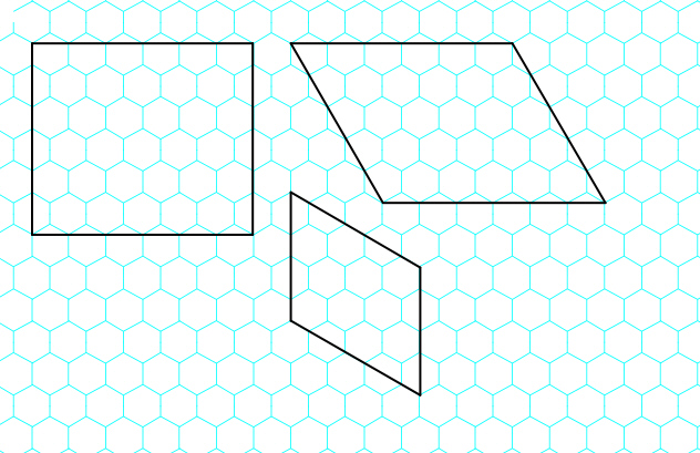
A - (top right) drawing the wall through the corners, "cutting" a bit off the hexes on one side
B - (bottom ritght) drawing it along the sides, cutting every second hex in half
C - (left) a combination of A and B in order to make rectangualr rooms.
Of these, A is clearly the most "perfect", from a geometric point of view. In A, the relation of each hex to each of its six sourrounding hexes and to each adjactant wall is always the same, whereas in B there are two, and in C even three, different forms of hexes as related to the wall.
As the original idea was to simplify the rules by eleminating the orthogonal vs. diagonal distinction, forms A and B render the whole hexboard project useless.
Of course, C is most satisfying from an aesthetic point of view. We will come back to this later.
For now, I will contiue using form A.
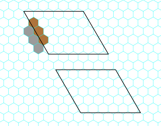
A slight improvement would be to shift the walls a little bit to not draw them through the corners, but throughthe middle of the sides.
With the "default" method A, when drawing through the corners, of the hexes neighboring a wall, one half on one side of the wall is "cut" a little bit (in the example above the brown hexes in the room), the other half on the other side is not cut at all (in the example the grey tiles in the corridor), although, technically, all this hexes are of the same size an in the same "relation" to the wall. In a full-drawn map the corridor will look wider and teh room smaller, although for the rules the corridor is still exacly one tile wide, and the room X x Y tiles big.
When we shift the pattern a little bit to the centers of the hex sides, all hexes are cut in the same way and all hexes along a wall have the same size.
This is just a quick thought, which makes little difference, but a minor improvment is still better than nothing, so I will use this form in the following.
Now, lets have a look to the middle section of the HQ board, drawn in the described way.
A hex pattern has three axes of symmetry, as opposed to only two in a square pattern. But it is still a two-dimensional pattern, so we can just choose two of its axes and correspond them to the two axes of the square-patterned original HQ board. The result is fully functonal and readily recognizeable:
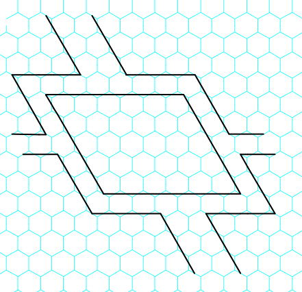
Now we have something to work with.
The only drawback is aestehtical: the rooms are parallelogram-shaped and look somewhat odd. In a "medieval" dungeon we expect the layout to be mostly rectangular, and the odd angles disturb the ambiente of the quest map.
But the topology of a hexagonal grid is not changed when we warp it in the plane (as long as no lines are cut or intersected). So we can just scew the whole pattern by 30 degree to make the walls rectangular:
Now the looks are greately improved while the topology is unchanged. every hex still has six adjactant hexes, and there's no distinction of orthogonal neighboring (when we define it as "sharing a side") and diagonal neighboring (defined here as "sharing a corner, but no side").
I first loaed up the pictures, then edited-in a lenghthy explantation. I just notice the latter was lost in the net...
Have no time to do it again now... Will update later.
Edit:
part one re-written
will be contiued
Edit:
finished
Well, you gave me something to think... just couldn't resist ... although I'm personally not for a hexagonal board pattern at all.
Let me explain.
Rectangular tiles (normally square-shaped, I will use he term "square" in the following) are
- more athomspheric
- more intuitively useable
- more suited for "good" and easy gaming rules.
- Square tiles look more "natural" in an indoor quest setting. You can even use the floor plates of the dungeon itself (as does HQ), so the gaming grid appears as a "real" feature of the ingame world. Hexagonal floor plates may be possible, but they don't look as "natural" or realistic as square ones, expecially in a medieval setting.
Moreover, in a dungeon with "mainly" rectangular arranged corridors and rooms, it looks better when the gaming grid correspondents to this layout.
Even in an outdoor setting, a rectangular grid comes more "natural", as it is used in practically all carthographis systems. A mapwith altitude and longitude lines looks "real", as many vintage maps have this gridlines.
- We are used to think in rectangular patterns from the real world, and there is nothing wrong with this. A gaming grid with squares is therefore much more intuitive than one with hexes. We can readily organize it in our head in a "X x Y" pattern.
- Rules-wise the square tiles have the advantage of having eight adjactant tiles around them, as compared to only six ones of hexagonal tiles. You are free to ignore the "orthogonal vs. diagonal" difference at all, treating all adjactant squares the same. If you want however, you can use this difference as an advantage, for expamle for a greater variety of weapons, by giving some weapons the ability to attack diagonally, and forbid this for others.
____________________________
Having said this, a hexagonal HQ board is still an interesting concept to consider, even if only as a Gedankenexperiment.
Well, the main problem seem to be the drawing of the walls on the hexagonal pattern. There seem to be at least three default forms:
A - (top right) drawing the wall through the corners, "cutting" a bit off the hexes on one side
B - (bottom ritght) drawing it along the sides, cutting every second hex in half
C - (left) a combination of A and B in order to make rectangualr rooms.
Of these, A is clearly the most "perfect", from a geometric point of view. In A, the relation of each hex to each of its six sourrounding hexes and to each adjactant wall is always the same, whereas in B there are two, and in C even three, different forms of hexes as related to the wall.
As the original idea was to simplify the rules by eleminating the orthogonal vs. diagonal distinction, forms A and B render the whole hexboard project useless.
Of course, C is most satisfying from an aesthetic point of view. We will come back to this later.
For now, I will contiue using form A.
A slight improvement would be to shift the walls a little bit to not draw them through the corners, but throughthe middle of the sides.
With the "default" method A, when drawing through the corners, of the hexes neighboring a wall, one half on one side of the wall is "cut" a little bit (in the example above the brown hexes in the room), the other half on the other side is not cut at all (in the example the grey tiles in the corridor), although, technically, all this hexes are of the same size an in the same "relation" to the wall. In a full-drawn map the corridor will look wider and teh room smaller, although for the rules the corridor is still exacly one tile wide, and the room X x Y tiles big.
When we shift the pattern a little bit to the centers of the hex sides, all hexes are cut in the same way and all hexes along a wall have the same size.
This is just a quick thought, which makes little difference, but a minor improvment is still better than nothing, so I will use this form in the following.
Now, lets have a look to the middle section of the HQ board, drawn in the described way.
A hex pattern has three axes of symmetry, as opposed to only two in a square pattern. But it is still a two-dimensional pattern, so we can just choose two of its axes and correspond them to the two axes of the square-patterned original HQ board. The result is fully functonal and readily recognizeable:
Now we have something to work with.
The only drawback is aestehtical: the rooms are parallelogram-shaped and look somewhat odd. In a "medieval" dungeon we expect the layout to be mostly rectangular, and the odd angles disturb the ambiente of the quest map.
But the topology of a hexagonal grid is not changed when we warp it in the plane (as long as no lines are cut or intersected). So we can just scew the whole pattern by 30 degree to make the walls rectangular:
Now the looks are greately improved while the topology is unchanged. every hex still has six adjactant hexes, and there's no distinction of orthogonal neighboring (when we define it as "sharing a side") and diagonal neighboring (defined here as "sharing a corner, but no side").
Last edited by Big Bene on August 25th, 2013, 5:25 am, edited 4 times in total.
Have a look
Rewards:
-
Big Bene
Halberdier- Posts: 1401
- Images: 11
- Joined: September 30th, 2010, 5:23 am
- Location: Siebeldingen / Germany
- Hero:
- Usergroups:
23 posts
• Page 1 of 3 • 1, 2, 3
Who is online
Users browsing this forum: No registered users and 1 guest